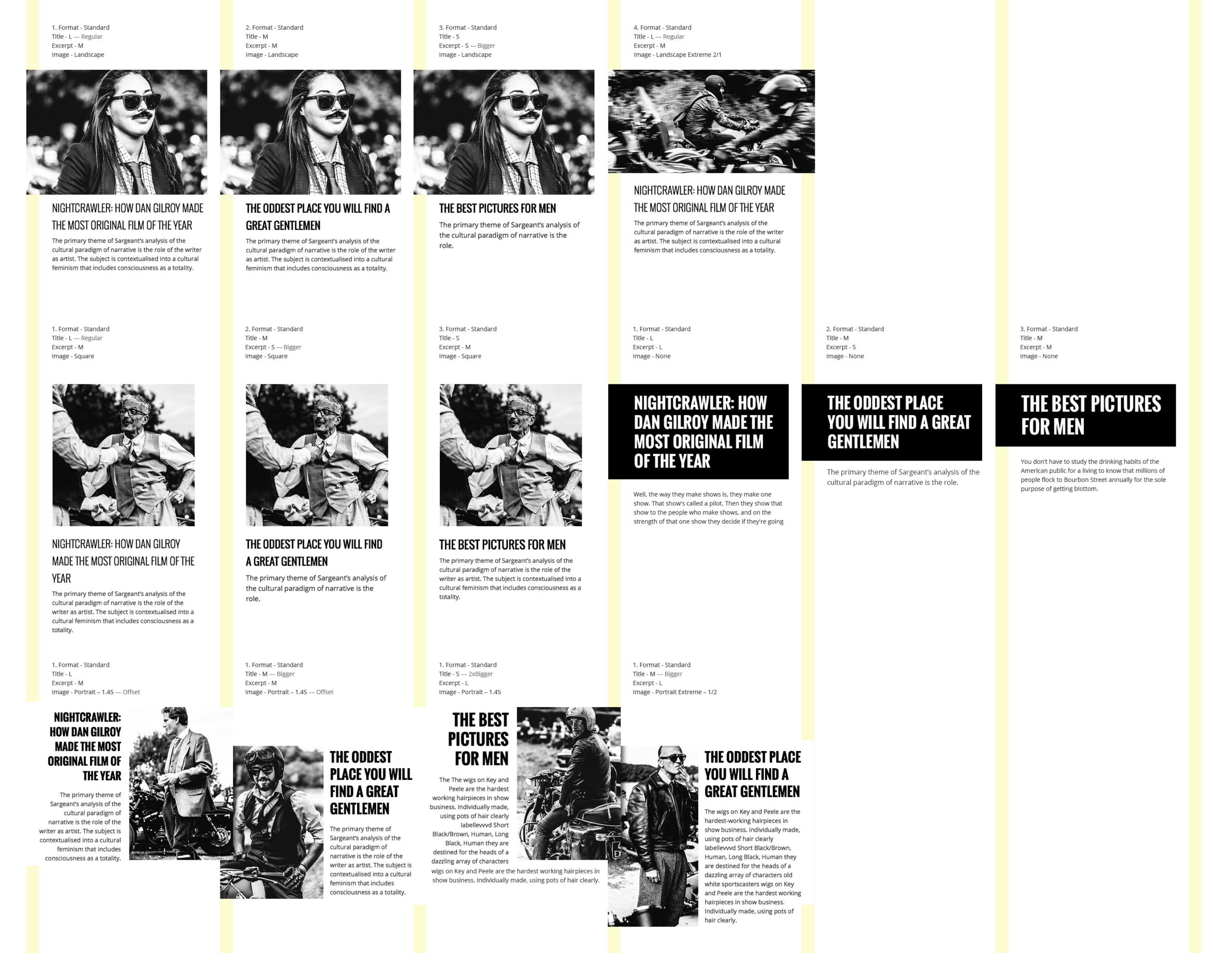
We have envisioned PATCH as a fresh approach to blog/magazine themes, focused around an algorithmic layout concept, meaning taking a large diversity of user content (posts) and cleverly generating a visual style that is in tune with the user’s intent and the whole website.
To keep things manageable, the design is focused on generating a specific layout for each post, based on: the featured image proportions (or it’s absence), post title and excerpt length.
The challenge was to offer the same visual weight for each post as we cannot programmatically determine the importance of each post content.
We have created a system where each masonry block is aimed at filling almost the same amount of macro space, no matter if the post has a long title or a portrait image (eg. small titles have a bigger font size than the long ones).
Below are some of the cases we have considered:
Maintaining the structure but still creating a dynamic layout, all the posts are placed on a grid layout with a three column gutter. Each post can overlap the middle gutter column (eg. portrait, wide) or stay away from it (eg. square). This overlapping is aimed at allowing for “good” visual accidents to happen from time to time.
Even if there isn’t a similar theme out there (that we know of at least) – we think that this approach to layout (and web design in general) is where the web is heading, more dynamic and more adaptable to the user’s needs.
